Maximum Utility

I was a tiny bit tempted to tidy up before I took these pictures, but I decided against it. Firstly because who wants to tidy their utility room on a gloomy February evening. And secondly because it would be cheating.

The truth is that without this slightly chaotic space, which occupies the other half of the cellar to the man cave, the rest of the house wouldn’t be half so calm. It’s the flapping swan’s legs under the serene glide, the violin virtuoso’s 10,000 hours, the…you get the picture.

It was also our saviour in December 2017 when, three months after moving in, it became our second temporary kitchen. Basic, a little too small for a family of four, but crucially inside the house and with hot running water – a step up from the garage kitchen we’d been occupying for the first onslaught of the Beast from the East. (It was great saying goodbye to the launderette too).

The shelving is the IKEA Algot system which is happily versatile. Once we no longer needed to house our pots, pans and table top oven (a Panasonic, which was brilliant and even served us for roast dinners) we kept the uprights in situ but swapped the shelves for baskets on runners, to help manage the laundry.

The idea is that the baskets live in our upstairs laundry cupboard until washday, when we work our way down the house collecting as we go. The multiple loads can be stored off the floor and sorted by room/owner for the return journey. Ironing (when we do any) hangs on the rail to the right.

The overflow freezer is an important component in our car-free life as it, together with the floor to ceiling cupboards in the kitchen, means we can bulk order all the boring groceries once a month and then top up locally.  The heated airers from Lakeland are great for drying delicates and (I think), greener than the tumble drier – In theory they can be folded away when not in use but in practice…

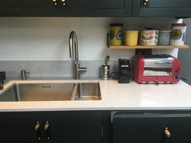
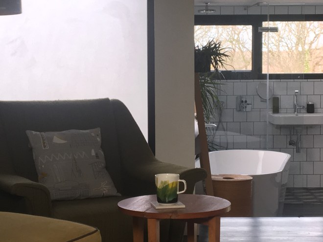
The rest of the space is storage for tools and cleaning materials and as glamorous as you’d expect. I’ve promised myself not to tinker this year, but I am quite tempted by a sliding screen or panel curtain to reduce the visual chaos. Completing the engine room feel we have our ethernet hub tucked under the stairs.


Kitchen Sink Drama

It was really important to me to get this area of the kitchen right. (This is one of Darren’s great pictures for the KBB shoot which obviously shows it at its best) I knew I wanted to keep the island clear, which meant that this little run needed to house not just the sink but the ‘breakfast station’ and the drying up. And I wanted it to look nice. Or at least, like the boys’ bathroom, I wanted it to be able to look nice. Because we all know that sinks attract really quite impressive levels of detritus, as my under-sink area so effectively demonstrates.

img_3171

The solution was a mix of higher budget investments and very affordable space planning (with the odd schoolgirl error in socket/shelf/splashback coordination along the way). The expensive bits first…the sink itself and the Quooker tap and soap dispenser. I went large with the sink because I am exceedingly clumsy. Too often in the past I’ve drenched myself with a tidal wave of scummy water while wrestling oven trays around to give them a decent wash. This Blanco sink is sufficiently wide for total submersion and having had a similar sized one in the old house I wouldn’t be without it. As a bonus, we had the extra space here for a half-sink too.

The previous kitchen had also sold us on a boiling water tap. It seems like an extravagance, but when you’re busy and worn out the time saved on boiling a kettle for the kids’ pasta or the after dinner decaff is a godsend. This version has a stretchy hose inside, great for rinsing the washing up. And it saves on the space for a kettle. The matching soap dispenser was pricey but it’s extremely neat and beautifully engineered – you refill it from the top and the design means that you can dispense soap without using your hands when you’ve been handling poultry or similar.

This installation didn’t come without trauma though. There was a period just after we completed the kitchen when the Quooker would gradually start to behave strangely, then pack up completely, and we’d look under the sink and find its plug halfway out the socket. Being the naturally calm and sane person I am, I  leapt to the obvious conclusions that we had either a secret malign lodger, a regular gaslighting housebreaker or a poltergeist…

It was only after about six weeks, when struggling to extend the spray hose fully, that I noticed its under-sink section was looped around the power cable, and pulling one was progressively yanking the other out. Tears of relief were wept that day (it was a long project).

So where is everything else you’re asking yourself – because I’ve looked under the sink, and around the sink, and I can’t see any dishwasher tabs, or washing up liquid, or other appropriate washing up detritus. Well that’s because they’re here…

I’m really pleased with these which are definitely among the cheapest of my design ideas – two little caddies screwed to the doors which keep the washing up essentials to hand, at a sensible height – and away from the general untameable chaos of the undersink world.

And now back up top for more cheap and cheerful ideas. Given that this kitchen was all about tidy worksurfaces it might seem odd to have the tea and coffee caddies out.

But I didn’t want the new space to be too pristine, and I’d fallen in love with their cheerful lineup on the window sill of my old kitchen.

To work it needed the neatest possible brackets, and these Pythagoras ones from Maze worked perfectly – with a shelf that Davonport made to match the cupboard interiors. A quick adjustment to the socket height (there’s always something) and we were done.


What Lies Beneath


I wasn’t sure how to illustrate this post, so here’s a bunch of wall shots from around the house. As an aside, it shows how hard it is to take a true colour picture of paint, under artificial light, on an iPhone.

But what I actually want to write about is the stuff under the paper/ paint/ tiles.  INSULATED PLASTERBOARD. Guys, this stuff is genius. All it is is some regular plasterboard with a layer of polystyrene about an inch thick fused to it, but boy does it make a difference.

As you probably already know if you live in one, a lot of our lovely Edwardian houses have rattly old sash windows. img_0098Although ours actually had knackered aluminium mixed with new PVC.

And so you move in, and you save up and install the best window replacements that you can afford, and still the house feels freezing. And so you stand at the window with your hands stretched out, and you realise that now you’ve fixed the windows, the bloody cold is coming in through the walls. Because as well as single glazed windows, they also have extremely thin brick skins.

It’s not an approach that would work for everyone, but when we bought this place we already knew that, with a myriad of ‘interesting’ wall  and ceiling treatments to deal with, we’d better off going back to the brick.


Plus with older neighbours on both sides we wanted to protect them from noisy boyishness. img_3236And we wanted to replace the windows with double glazed timber sashes which finished flush with the wall on the inside, but we couldn’t run to the higher spec super expensive slimline versions. Finally the rooms were all of a decent size.

So while we couldn’t be sure how much it would help, losing 5cm of width for an unspecified but hopefully significant amount of warmth and peace seemed a gamble worth taking. And I’m pleased to report it’s worked. Admittedly we’ve not had the coldest of winters but the house is definitely cosier. In fact it’s 5pm* on a February Saturday, there’s not a radiator on in the house, and I’m sitting here in my PJs feeling comfortably warm.

*Disclaimer, I am usually dressed by 5pm on a Saturday, but I’m having a duvet day because of a cold.


Man About The Cave

So with today being pretty much exactly twenty years since we started dating, I’m singing the praises of my lovely husband Mark, and his contribution to the project.

img_3218-1

He’s always been great at layouts and it was his design for our original loft conversion that took the neighbourhood by storm, but he really got into his decorating stride with the man cave.

We stole the idea of the cave, which takes up half of our extended coal cellar, from friends who’d turned their cellar into a games/ home cinema room. We loved that idea, and also had a fair volume of drums and guitars to deal with. In the old house they’d lived in the back half of the sitting room, where I’d never been fully convinced of their decorative merit. (Although they look much nicer against this Little Greene Hicks Blue wall than they ever did against the off white walls in the old house).

img_3217

Planning the layout took a while and there were several hiccups along the way when various structural elements and building reg requirements meant we couldn’t divide up the space quite as we’d anticipated (the other half is our utility room).

The instruments fit neatly into the excavated front bay, but we also needed to house a rather large collection of vinyl and CDs, a tv and several amps. As everyone knows, the only sensible way to house your records is in an IKEA Kallax unit, and one bonus of the build changes was that we were able to recess it into the wall (Second time lucky – the first set of stud work was an agonising two centimetres too narrow).

img_3214


I had a white 4 x 4 Kallax sitting in the garage ready for installation but as you can see that’s not what we ended up with. I’d fallen into the default assumption that we’d want to make the space as bright as possible, whereas Mark’s, correct, judgement, was that a cosy club-like feel would bring the best out of the room. Luckily for me, Mark’s interpretation of clubland is more Hackney than Highlands so we were spared the stags heads and tartan of a  typical Pinterest ‘man cave’.

We pressed our old kitchen sofa into service and brought a brass ceiling plate on line to combine two bargain Anglepoise lamps from the John Lewis clearance sale into an overhead light fitting. (We re-used their original enameled metal roses for our vintage desk and downstairs loo lights).

So far so lovely, but Mark really excelled himself when it came to designing the CD storage. His concept of custom made ply shelves hidden behind sliding doors was beautifully executed by our joiner Jan.

img_3213-1


I especially like Mark’s design for the shelf joints, and the fact that the doors also hide the ugly but necessary cellar-y and man cave stuff like electricity meters and amp cables.  We’d originally intended to paint the doors, but fell in love with the seventies executive office vibe of the green/grey fireproof MDF.

img_3216


Two months later I found the finishing touch at the Olympia House & Garden show, a vintage poster featuring Mark’s favourite city and one of his favourite bands. (Spot the Fab Four).


Going Green

A friend just introduced me to the #myhousethismonth challenge on Instagram which invites you to post pictures on the theme of the day.

I’ve confined myself to bed to get over a lingering cold so was surprised how easy it was to pull together a montage from a couple of old pics plus the view from my pillow – seems like I’ve ended up with a green themed house almost by accident.

It helps that we’re lucky enough to overlook the Flats of course – even at this time of year the trees provide a green transfusion for free.

And that I chose Little Greene’s Obsidian Green for my kitchen – a last minute switch from dark blue but definitely the right decision.

Still trying to be green too – Mark is off refilling our olive oil at Cups and Jars as I type!

Thrown

img_3109-1


I had been coveting an Eleanor Pritchard throw ever since I first saw them in Heals, must be upward of ten years ago. So when Mark diverted from stocking filler shopping and came back with a large and squashy bag my hopes were up…and all my wishes came true on Christmas morning. So it was rather disconcerting when the chaos of Christmas had subsided and it was still resisting my efforts to settle it in.

img_3115


I thought I knew exactly where it belonged – on the back of the lounger where the old Habitat throw had lived so happily for the last fifteen years. But it just wasn’t working – maybe the colours were wrong.


img_3113-3


Next I tried it on the back of the Robin Day chair, better but still not right. Probably just a bit too much fabric for the size of the chair, and too much risk of it sliding off when anyone sat down.


img_3112


So it was third time lucky when I draped it over the back of my vintage sofa – with the bonus that it’s the very first thing you see when you come into the room – home at last.


I’m not sure interiors stories should have morals, but the lessons are…

  • A lovely object deserves the perfect setting
  • You won’t know what that is til you try
  • Keep trying til you get it right

Laying it Out

Really interesting visit to my friends’ house last night, to help them think through some space dilemmas. It’s a good size three bed Edwardian terrace but with the original bathroom at the garden end of the kitchen rather than upstairs. They’ve extended into the loft to gain two extra bedrooms and a bathroom, but still don’t think the living space quite works.

We had lots of good ideas as we walked around but I could only really test whether they worked when I got home and plotted them out on my trusty graph paper.

Whatever tools you use, and whether you do it yourself or employ an architect or designer, scale drawings are a must, otherwise it’s just guesswork. They don’t need to be neat (mine certainly aren’t) but accuracy is important.

The three main challenges are:

  • Creating a properly comfortable dining space
  • Getting more storage in the right places – especially for outdoor clothes and shoes
  • Resolving the dead corridor space created when the previous owners carved an upstairs family bathroom out of the back bedroom – shown here in red

Plus they need to make room for a piano …

One of the problems they faced was one we shared in our old house, which is the back half of the sitting room, which feels like it ought to be the perfect dining space, is just a little too cramped, mainly because the door currently opens into that room. One way to fix that would be to rehang the door, or ideally install a sliding or pocket door, and this approach is great for keeping costs down.

However with the piano to fit in too, this might still feel a bit cramped. And this arrangement doesn’t achieve their other aspiration – to create a better connection between the house and the garden.

So the obvious next step is to look at extending – either into the side return or by knocking into the old bathroom (which isn’t used and would be repurposed as a utility room in option 1)

Side return extensions are great (I’ve got one) but also expensive and disruptive. And weirdly, the fact that the kitchen already has a bay jutting into the return makes it feel less worth doing – because the space gained is less. I still think it might be worth it, to have a full five metres to play with, but it’s worth testing the less traumatic bathroom knock through first.

A dining table would sit nicely at the far end, perhaps with bifolds or glass sliding doors to the garden. It does mean relocating the loo though, and losing a wall means less space on which to site cupboards and worksurfaces. I’m not sure this layout is right, but it’s food for thought at least.

Meanwhile upstairs I’m suggesting losing a room to gain some space: by swapping the current configuration of bathroom, corridor and small office for a more spacious bathroom with a desk ‘lobby’. Another route – which has just occurred to me, hence no drawing – would be to take all the space for a really generous combined bathroom/ utility room (upstairs utilities are very big in the states and catching on here) and combining the office with either the front bedroom guest room or rear sitting room. I think this might be the best route yet…

UPDATE – just mapped out the upstairs utility and bathroom and I think it could work

From the desk of…

I’m not sure yet, but this could be another ‘What Went Wrong Wednesday’ piece, although I’m actually quite pleased with the finished project. I’m writing this sitting at my ‘desk zone’ – which is a small area carved out of the corridor between kitchen and sitting room – counterpart to the downstairs loo which I featured last week.

I know lots of people use a corner of the sitting room, or have a study which doubles as a spare room. But between us we now work three days a week from home, so wanted a space which was just for work. And where the wires and files could express their natural chaos without sending me haywire.

I also wanted to provide a good home for our vintage filing cabinet – found in a clearance store on the Romford Road soon after we moved to Forest Gate. In the old house it had done sterling service as a bedside table in the guest room/ office, but that had always seemed beneath its dignity. And this light from Archive Furniture needed the right sized space to shine.

The cabinet is a big beast though, and despite obsessive measuring throughout the build I got my sums seriously wrong when ordering this Robin Day 675 chair to tuck in beside it. (Or maybe I just forgot about the rather sturdy column created by boxing in the soil stack*, it’s all a blur now). Luckily the Day chair has found an alternate home in the sitting room, and our left over dining chair fits neatly, important for a thoroughfare.

That wasn’t the only best laid plan to go wrong. As you can see it’s not a big space – around a metre wide and 55cm deep. I’d asked Jan our lovely main-project joiner to create cable cutouts on both shelves so that the printer and charger cables could be neatly tucked away – one plugged into the double socket at desk level and the others underneath. This on the assumption that we’d both be using laptops, and that since all our home and work kit was either Apple or Dell, we’d only need two chargers.

A year later, two work tech upgrades and some middle aged long-sightedness mean we now have to house four chargers, a keyboard and a monitor (improvised monitor stand courtesy of Newham Bookshop). Which means hardly any free surface, and lots of competition for the sockets.  Last Saturday morning, overwhelmed by wires and remortgage paperwork, I decided I’d had enough.

So after the filing, recyling and shredding, which took half the day, we dug out a four socket extension cable from the electrical graveyard in the cellar. It’s pretty ugly but blessed with a wall mounting plate which meant it could be tucked out of sight behind the soil stack column. The little cable clips are very quick to do but really help keep it tidy.

Thence online for a monitor arm and we could send Michael Rosen and Chris Difford home to the bookshelf.

*Which reminds me that where I’m sitting now would have been outside before the project started, which is a slightly odd feeling.


Books do furnish a room

One feature of the house which gets a lot of comment (not always complimentary) is the high level bookshelves around three walls in the back half of the sitting room. I love them as for me they encapsulate the way I approached the house in a single project:

img_3141spending much too much time with interiors mags and Pinterest

trying to imagine  a fairly conventional space in a slightly different way

responding to the unique characteristics and opportunities the house presented

reflecting the way my family actually live

In the old house we had alcoves aplenty, and inevitably they became bookshelves. Two in the sitting room and a jam-packed overflow in the study/ guestroom. I knew repeating this would undermine the properly restful vibe I was trying to create in the guestroom.

At the same time the previous owner’s gung-ho attitude to sitting room chimney breasts had left us an alcove down (and made space for our cocktail cabinet).

img_3142


I’d sourced some vintage Danish shelves for the remaining alcoves that would be lost under half a hundredweight of books. The ‘vignettes’ are still a work in progress, but the simple design and warm colours of the system are just too nice to be obscured.

And some travails earlier in the project meant we’d already had to say goodbye to the cornicing in the back half of the room.


The clincher was that, much as we cherished our books, we’d converted to tablets for everyday reading, making ready access less important. So up we went. Still dithering over a library ladder, but meanwhile our vintage kitchen steps do a fair job.

img_3107.jpg


Kitchens, Bedrooms and Bathrooms

I’m thrilled that KBB magazine have published the article about my Davonport Shoreditch kitchen in their March issue, on sale now. Not just because having my home featured in an interiors magazine would be very high on my bucket list, if I had one.

But because publication means I’m now free to share my own pictures of the kitchen as the mood takes me. Although I’ll not be putting them up against Darren Chung‘s professional efforts for the magazine anytime soon. I worked on the kitchen with John Place who also helped me design the kitchen in my previous house.